In case you were wondering what I am working on now, My answer is wireframes.
Time for a little fun with metaphors and crisscrossing conceptual boundaries
The Real world called and wants its wires back.
What are wireframes?
Wireframes are an early draft of a user interface. Wireframes are visually sketchy, deliberately omitting detail in order to focus on the conceptional design. Their purpose is to enable a thorough design and review of the structure and flow of the design before moving on to surface details such as color schemes and typography. They are intended to counter the constant temptation to focus on surface details prematurely.
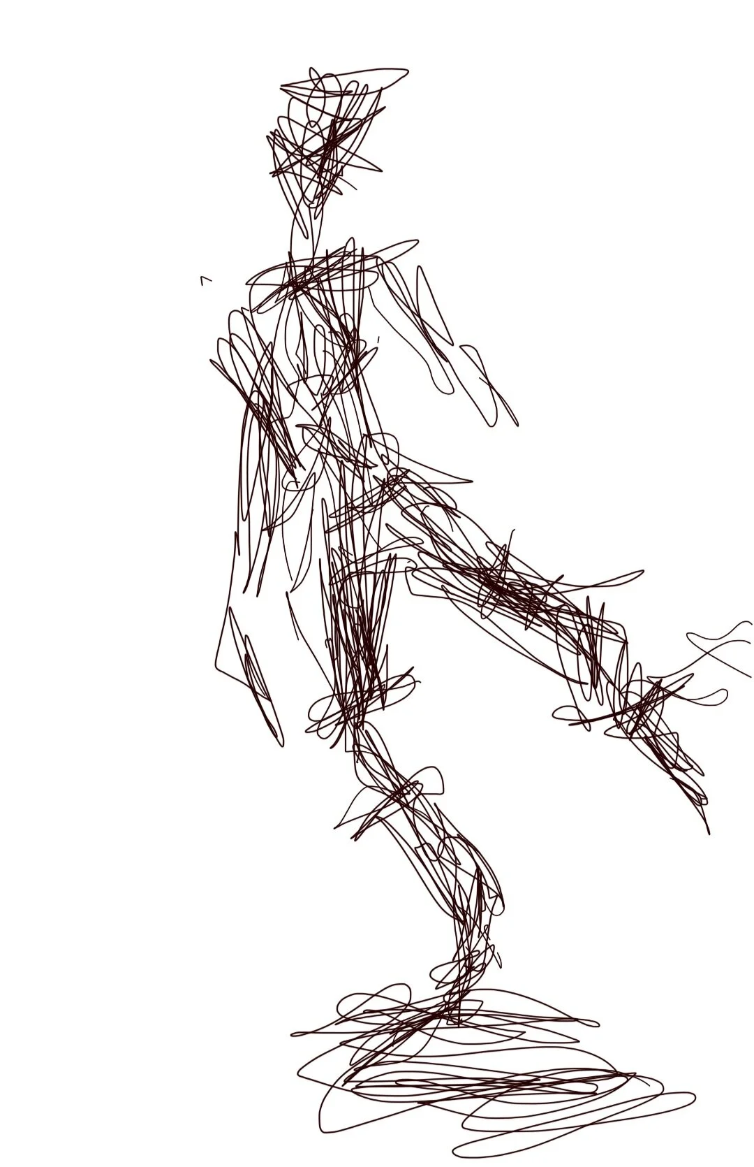
This might be a slight exaggeration of what I mean by a sketchy wreframe, but you get the idea, i’m sure.
This little piece of sculpture i made in brushed aluminum is based on the common image placeholder used in graphic design apps. It is iconic and uniniversal across many design realms, even though each brand gives it a slightly unique spin. It is so iconic I felt it deserved its own presence in the real world. So meet the image icon all dressed up in dazzling 3D. Well, actually, this is a 2D virtual mage of it.
Typical Wireframes
A wireframe is generally thought of as a black and white line drawing of a screen with placeholders for graphics and greeking or phony text to show where finished content would appear. They may include a diagram or site map showing the overall interaction follow or information architecture.
A sketch of a form.
Its a Skeleton
A wireframe is a skeleton of a design much as a painter or sculptor might create a stick figure or armature of a human figure to refine proportions before fleshing out the full content and surface details of the finished work. It is the mark of amateurs to always focus on surface details immediately. In doing so, they skip the most important step. This is true in all types of art and design.
inside the belveal art studio. Even free form figures composed by welding pieces of steel together, even when the goal is abstraction, even these have some reference to reality.
Origins
The term wireframe was borrowed from CAD engineering apps which displayed solid objects being designed as hollow shapes depicting 3D volumes while omitting surface details. This was done in the early days of CAD to reduce the processing required to display a virtual object. CAD borrowed the concept from real world. Now the real world called and is borrowing it back.
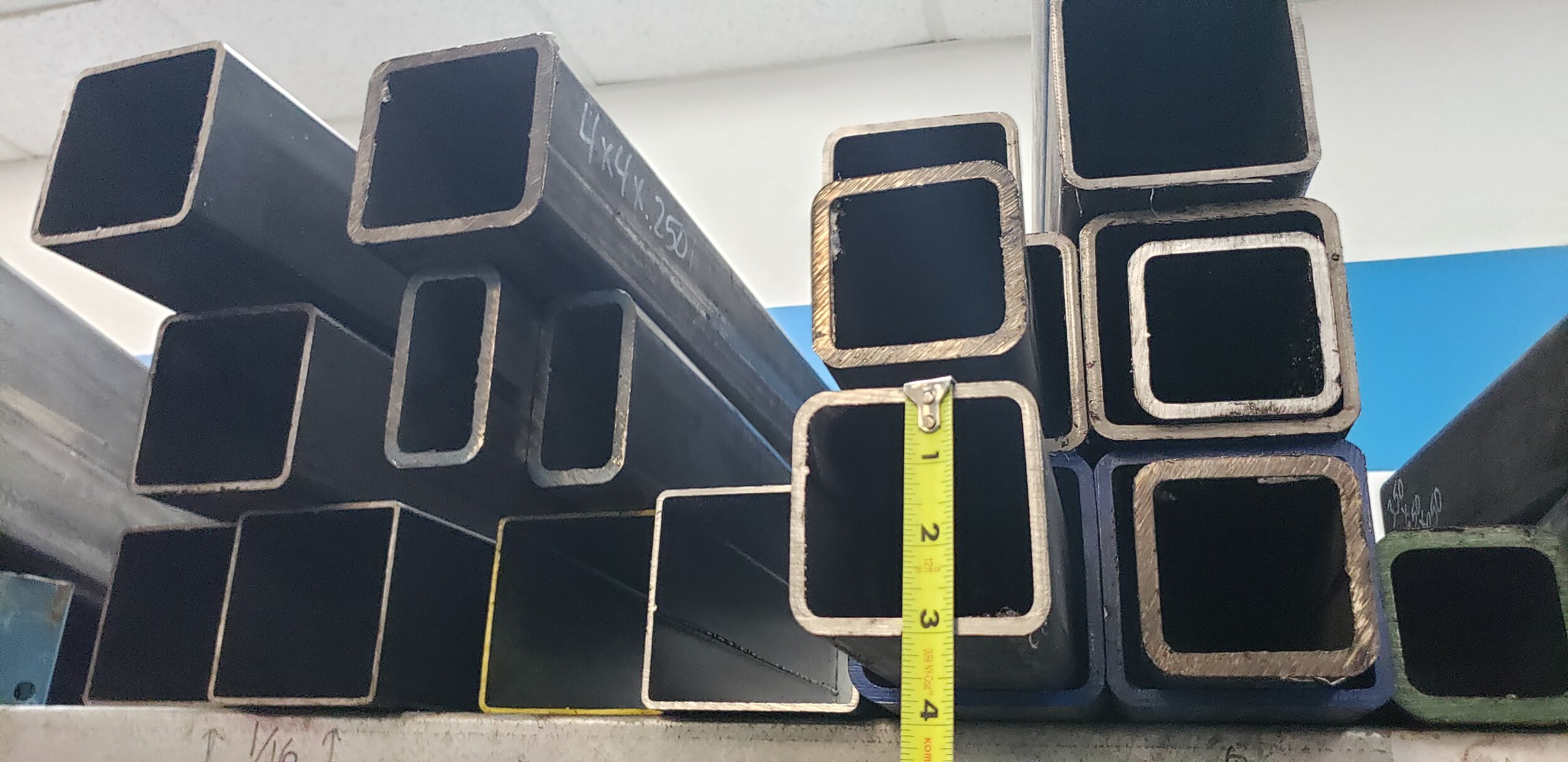
Shopping for materials. I’m definitely on the grid.
Big Sculptures Made of Wires
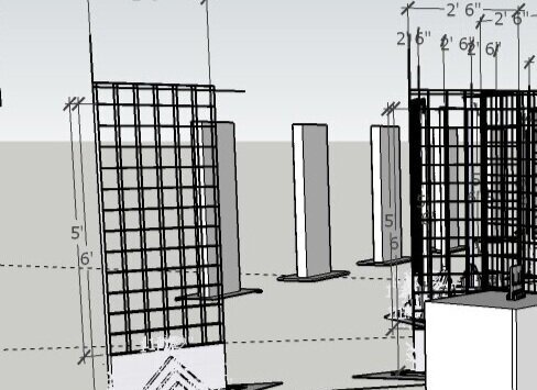
These large sculpture pieces will be utilizing all three of these instances of wireframes. Real wire depicting 3D CAD-like forms of smart devices with UI imagery being laid out in a wireframe on a grid.
Material
All the mobile UI design geeks will want to know if I am applying the Android Material UI design standard. Answer: Well, of course! But my favorite material is still steel!
Art is where you find it. I take a lot of photos while researching materials. Some those have become personal favorites.
Metaphors All Around
Digital technology is full of metaphors. Applying these in whimsical ways in my art is fun. It’s a source of entertainment for me and I hope you enjoy it too.
Transformation
It is important to recognize this has been the major method for improving the quality of the user experience since the beginning of computing.
Transforming the blinking cursor command line, which was intimidating to all but serious nerds into the rich interactive graphical environment we enjoy today. And while there remain many user experiences that still in need of serious improvement, there is no comparison between then and now.
Those with me on this art-tech journey may recall my first set giant smart devices somewhat resembled the one on the right, though without the grid wire. It was solid concrete, which looked cool and earthy and industrial.. My soul loved it.. My back suggested I seek a more lightweight alternative. I like the grid.
Now, here’s an idea! Or is this a place to put an idea if you had one? Am I being too literal and negative? Are you positjve?
Metaphors Becoming Real
Moving forward, it is interesting to note is that things in the virtual world tend to eventually merge with or displace their metaphorical namesakes, often eventually erasing the distinction between the virtual and real thing.
Simultaneously, ordinary objects in the real world take on digital characteristics to become smart connected devices creating this growing Internet of Things, or IoT.
What does it all mean?
The result is that real and digital worlds are beyond overlapping. They are mixing in a big swirl such that it is really no longer practical or even possible to clearly mark where one ends and the other begins.
My art is about all that, with a bias to keep a substantial part of it on this side of the glass.
More about this on my page “Art of Metaphor Fun and Prophet”


