Sculpture is relief for the over digitized
In search of Iconic gestalt
heavy Industry in the digital age
transparency
The same approach of transparency and generous negative space that I established with my figures, I felt very strongly must be applied similarly with my techXpressionist works as well. The use of heavy materials, steel and concrete require a balance of hollow space to keep a friendly and approachable feel. Otherwise, the large smart phones could easily become monsters from sci fi, which was not my goal.
Mayor’s choice
Mayor Jeff Cheney picked this one.
negative Space
Compelling amounts of negative space keep the art friendly with a sense that there is room to inhabit emotionally. What is interesting to me is that this feels like a first person experience, that is, the audience feels that they themselves are able to emotionally inhabit these spaces rather than the person that is the subject in the case of figure..
Iconic imagery is where you find it.
handy with tools are we?
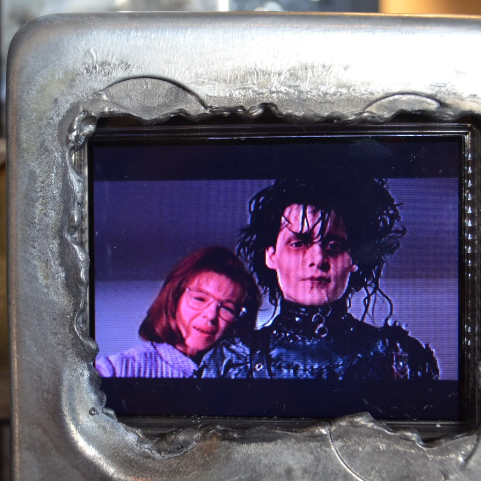
A steel icon playing a video of another steel icon
Iconic personalities
Rubber Ducky
In searching for icons, the most cliche images and objects come to mind, familiar objects in their most generic form.
On the other hand, these are real objects, not made up in an illustrator’s psyche or muddied by marketing department’s knack for inauthentic imagery.
To use real objects is to inherit elements from the real world context from whence they came. Real objects are seldom as cliche as they are in the virtual world. It is to allow each object to express its own authenticity.
Just like people, every real thing has a story to tell.
What the?
Nobody really knows why the rubber duck icon is so important.
It just is.
404
Sorry, this link appears to not be connected to anything
IT professionals as a lot are sensory deprived.
Time spent in the space behind the glass, programmers and analysts have expressed feeling a deficit of tactile experience. Some take up gardening or hiking in the wilderness and such to get their full sensory experience back.
Big Design logo
Artist’s personal favorite.
Everyone loves it
Do you know where your slinky is tonight?
why icons
In the case of the icons, the steel square defined the perimeter of the space while the object the interior form and subject matter. Yet visually, it is the shape of the negative space that i find most compelling.
J. Shuh logo
My friend, J. Schuh’s logo rendered in steel
Linn Gear logo
A thank you note to my friends at Linn Gear for giving me awesome art ingredients from their bin of test parts
Cyber Security
I see this icon many times daily
honest use of Materials
Honest use of materials and celebrating their flaws as well as beauty. Where steel or other metals, wood, concrete, plaster or paint. Each material has a look and behavioral properties unique. Putting these on display brings us nearer the earth or down to earth, however you wish to say it. It stimulates our intellect to think in terms of our actual surroundings and the laws of physics. It celebrates that we are physical beings with our own flaws and physical properties. Reconnecting mind caught in a swirl of abstractions to with the physical self in ordinary ways. Sight touch, presence of physical form.
The trouble with recognizable objects
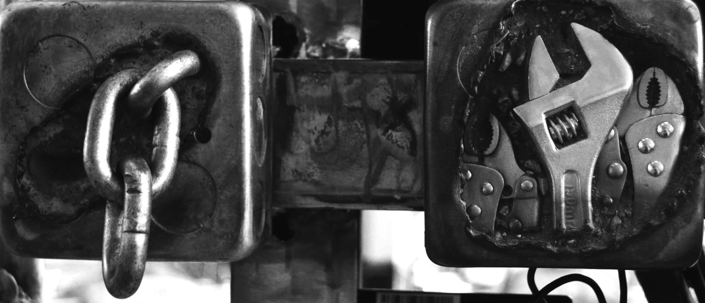
I avoided using any existing objects. That was very labor intensive but purist from my art point of view. So, having done the purist thing, I gave myself permission to explore including real objects that were of the type of images one might see on a smart phone or computer screen, very cliche. These included chain links and gears. Chain links were easy to obtain, gears not so much. They were all still in concrete.
The rugged aestehic
pure virgin metal = pure art
So, having done the purist thing, I gave myself permission to explore including real objects that were of the type of images one might see on a smart phone or computer screen, very cliche. These included chain links and gears. Chain links were easy to obtain, gears not so much. They were all still in concrete.
Then through trying a lot of variations, which included pieces with no concrete, i decided that the space was more interesting. Actually this was simply reverting back to the motif of my figures which were mainly about the negative space defined by a minimalist 3d sketch in space.
For a long time I avoided using any recognizable objects. They can take the art in directions i didn't intend. And once identified, you can't unsee them. I stuck with new stock steel only. Then i decided to explore inserting familiar items but in a very deliberate manner where the imagery and connotation was deeply relevant to the work. Pursuing iconography and the inverted skeuomorphism led me to cliche objects typically comprised in icons. That included gears and that led me to our buddies at Linn Gear.
tool marks and methods
Not hiding the construction methods or functional mechanisms or true materials. but making them part of the art, part of the aesthetic, an integral part of the intellectual and emotional experience. Exposing the user to traces or remnants of then creative process that brought the thing about, skiing them participants in it rather than just an audience to selected elements. It’s Toto, pulling back the curtain. Letting us talk to the wizard person to person.
The artists voice
If Van Gogh had hidden his brush strokes, you might be asking, “Vincent Van Who? Brush strokes are the artist’s voice. I have approached the metal working with this in mind, not hiding the tool marks but celebrating them as part of the art. This is an advantage of working directly in the final medium. unlike a process such as casting where the artist works in clay or wax, and the image is translated into bronze or other cast material. What are the marks of the artist and that of the process, whether executed by the artist or other craftsmen can be quite confusing. In direct metal sculpture, there is no such ambiguity. It is all me..
Metal objects or virgin metal
The first bunch of icons I made were concrete and contained steel images mimicking fossils emerging from stone. The objects were all completely hand made by me.
So This risk of misfire. Yet, flipping that around to positive, I wondered, what if used objects to do that a deliberate manner? That is, introducing recognizable objects that hold a lot of meaning to the audience. And that meaning would not be incidental noise, but highly relevant to the subject. Possibly it is the subject.
Blockchain
So, when the topic of blockchain came up I immediately began exploring combinations of chains and blocks, literally depicting the literal substance of the metaphor, incorporating negative space as a primary element.
art as background
She photographed the art then made it her background on her iPhone, adjusting the scale to get the image of physical steel and concrete icons aligned with those IOS. It reminded me that when I first created that piece, I spent quite a bit of time adjusting position of those steel and concrete icons making sure the proportions were matched with the iPhone. Haha. So now we see that paid off.
The big IPhone
Note that the art piece was based on the original iPhone which had only five rows of icons. Later models and OS increased that to six rows and the number and layout now can vary quite bit across the wide array of smartphones. The original Iphone design remains the most iconic.
figures
This was the result of years of evolution of my own unique approach which began with gesture drawing of human figures which I translated into three dimensions using welded steel. The intention is to create a definition of volume through a minimal form that will trigger the mind of the audience to perceive the form of the subject there by participating in the work. This is much like the work of a writer using words that spark images in the mind of the audience.


